Designing Edtech for the Student, Parent and Teacher Triangle
Students, parents and teachers need different things from a learning app. Here is how to serve all three without turning it into surveillance.
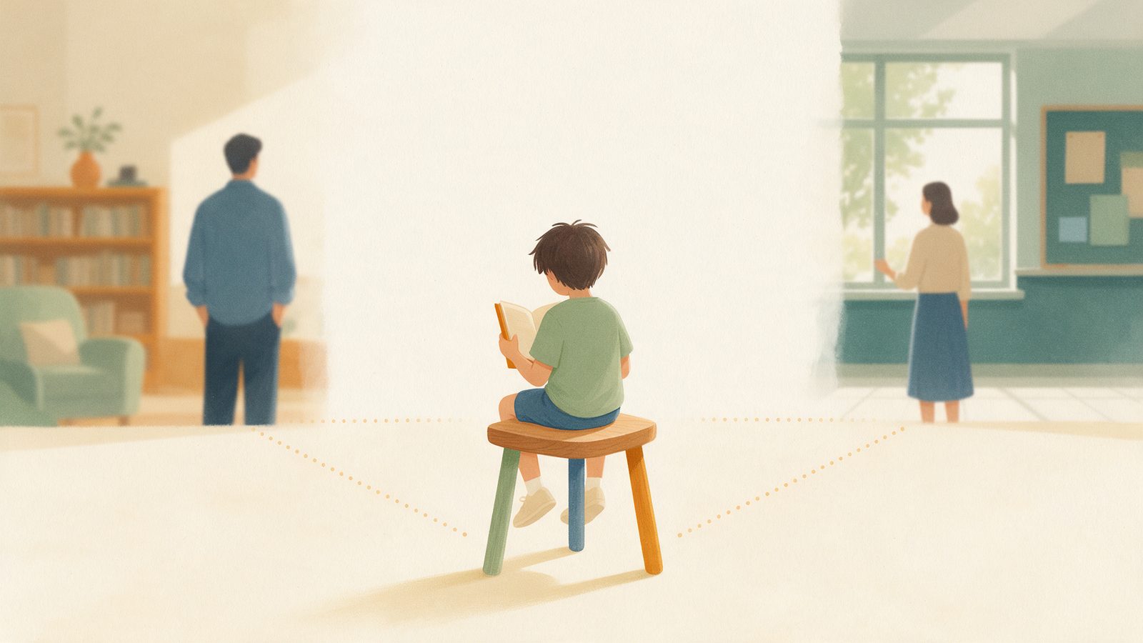
A learning app for kids is never really used by one person. The student uses it. The parent pays for it, worries about it, and checks on it. The teacher may assign it, or may be trying to work around it. Each of those three people wants something different, and most products quietly pick one of them to serve and treat the other two as an afterthought. Build for the parent alone and you get a surveillance tool. Build for the student alone and you get a game that nobody trusts. Build for the teacher alone and you get one more dashboard on a pile of dashboards. Building a learning app taught me that the hard design work happens along the edges of that triangle, in the space between people, and that getting it right is mostly about restraint.
Three corners, three different needs
It helps to start by being honest about what each person actually needs, which is often different from what they ask for.
The student needs autonomy and dignity. Middle school is when kids start building an identity separate from their parents. They want some control over what they do and when, and they are acutely sensitive to being watched, judged or embarrassed. Self-determination theory, a well-known framework in motivation research, names three needs that help explain this: autonomy, competence and relatedness. Kids put in more real effort when they feel some choice in the matter, feel they are getting better at something, and feel connected to people who care. A product that strips away choice and broadcasts every mistake undermines all three.
The parent needs a clear picture and one way to help. Most parents I know do not want more data. They want an answer to a simple question: is my kid okay, and is there anything I should do? The best thing a product can give a parent is a short, plain summary and a single, specific way to help this week. "They have been working on fractions and getting more confident. Try asking them to split a pizza recipe in half this weekend." That is far more useful than a chart of accuracy by day.
The teacher needs signal without extra workload. Teachers are already stretched. They do not need another login, another inbox, or another set of alerts. What helps is a short, accurate signal: which few students might need attention, on what, and why. If a tool makes a teacher's week longer, it will be abandoned, no matter how clever it is.
Where products go wrong
Most of the failures I have seen fall into a few patterns. I have been tempted by every one of them.
- The surveillance dashboard. Every click, every wrong answer, every minute logged and shown to the parent in real time. It feels like transparency. To the kid, it feels like being followed around by a camera. Kids under constant observation tend to play it safe, avoid hard problems, and stop taking the risks that learning requires.
- The tattling notification. "Your child got three questions wrong." "Your child stopped after four minutes." These turn the parent into a hall monitor and the app into a snitch. The kid learns to see the app as an adversary, and the dinner table becomes an interrogation.
- Duplicating the teacher's job. Some products try to become a second teacher, assigning work that clashes with what is happening in class, or grading in ways that contradict the teacher. The kid ends up with two bosses who disagree. The teacher, reasonably, stops trusting the tool.
- Engagement metrics dressed up as progress. Streaks and time-on-app shown to parents as if they measure learning. They measure attendance, and sometimes not even that.
Think of it like a youth sports team. The player needs to play. The parent needs to know how it is going and how to support from the sidelines. The coach needs to run practice. Everything goes wrong when the parent starts coaching from the bleachers, or the coach starts texting parents after every missed pass.
Privacy between the corners
This is the part people skip, and it matters more than anything else in this post. Privacy is not only about keeping data away from strangers. It is also about what each person in the triangle can see about the others.
A middle schooler should be able to keep some things to themselves. In our own testing at home, the single biggest change in my kid's willingness to try hard problems came when they understood that their messy attempts and wrong turns were theirs, not a report card for me. They started guessing more boldly, writing out their thinking, and asking for hints, because a wrong answer was no longer a public event.
In practice, I think the defaults should look something like this:
- Drafts and attempts belong to the student. The process of working something out, including the wrong turns, should be private by default. What gets shared is the summary of progress, not the scratch paper.
- Reflections and journals are the student's alone unless they choose to share them. If you ask a kid how they feel about learning and then show the answer to their parent, you will get honest answers exactly once.
- Parents see trends, not transcripts. "More confident with fractions this week" is useful. A replay of every keystroke is not.
- Teachers see what they need to teach, which is usually where a student is stuck, not everything the student did at home.
- Safety is the exception. If something suggests a kid may be at real risk, the right adults need to know. That exception should be narrow, clearly explained to the student, and never used as a back door for general monitoring.
The rule of thumb I use: share the kind of information a thoughtful tutor would share with a parent after a session, and nothing a thoughtful tutor would keep in confidence.
Design principles that hold the triangle together
When we got stuck on a design decision, a few principles helped more than anything else.
- Design for the student first, and let the others look over their shoulder. If the student does not want to use it, nothing else matters. The parent and teacher views should be built on top of a product the kid actually likes.
- Fewer, better messages. A weekly summary beats daily alerts. One suggestion beats ten. Every notification should pass the test: would this help, or just worry someone?
- Make every view explainable. If a parent sees "needs practice on ratios," they should be able to see why in plain language. If the student is shown a recommendation, they should know where it came from.
- Tell the student what others can see. No hidden views. If the parent can see a summary, the student should know exactly what that summary contains. Transparency in both directions builds trust.
- Support the teacher, do not replace them. Align with what is happening in class when possible, and step back when it is not. The teacher is the professional in the room.
- Give each corner one action. The student gets one next step. The parent gets one way to help. The teacher gets one or two students to check on. Clarity beats completeness.
Takeaways
- Each corner needs something different. Students need autonomy and dignity, parents need a clear picture and one way to help, teachers need signal without extra work.
- Avoid the three classic mistakes. Surveillance dashboards, tattling notifications, and products that compete with the teacher all erode trust.
- Let kids keep their scratch paper. Attempts, wrong turns and reflections should be private by default. Share progress, not process.
- Parents: ask for trends, not transcripts. If an app gives you every click, consider whether you really want it, and what your kid thinks of it.
- Be open about who sees what. The student should know exactly what their parent and teacher can see.
- Keep the safety exception narrow and honest, and never let it become an excuse for general monitoring.