The Best Learning App Is the One Your Kid Closes
Minutes on an app are the wrong goal. Here is how to judge a learning app by what your kid does after the screen goes dark.

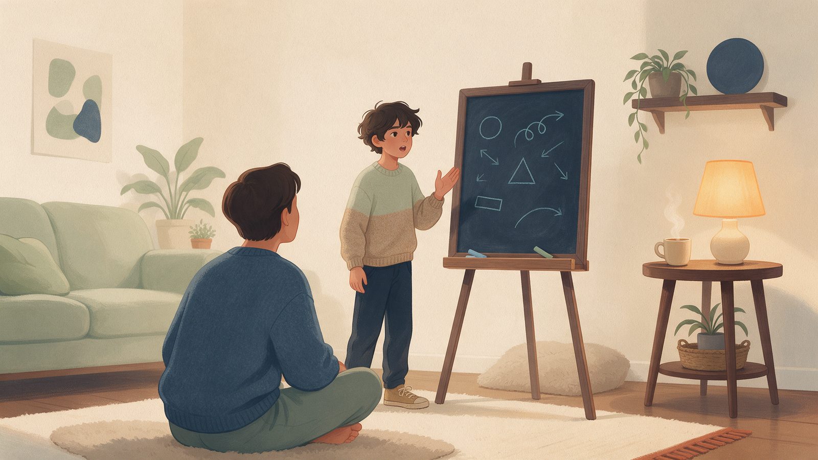
Most apps on your kid's phone are measured by one number: how long they kept your kid there. Time in app, sessions per day, streaks, the little red dot that pulls them back. When we started building a learning app for middle schoolers, I assumed we would measure ourselves the same way, because that is how every product dashboard I have ever seen at work is set up. Then I watched my own middle schooler finish a lesson, put the tablet down, and spend the next twenty minutes explaining the idea to me while I chopped onions. That twenty minutes was the best thing the app did all week, and no dashboard on earth would have recorded it. That was the moment I stopped believing that minutes on the screen are the goal. For learning, they might be the cost.
Why minutes on the app is the wrong scoreboard
In engineering we have a saying: you get what you measure. If you reward a team for closing tickets, you get a lot of small tickets. If you reward a learning app for time on screen, you get an app that is very good at holding attention and only incidentally good at teaching.
The two are not the same thing. Holding attention runs on novelty and rewards. Learning runs on effort, practice, and connecting a new idea to your actual life. Much of it happens away from the screen: trying a skill for real, explaining it to someone, getting it slightly wrong in front of a person who cares about you, and fixing it.
Think of a good swim coach. The coach does not want the kid standing on the pool deck listening to instructions for an hour. The coach wants them in the water. The instructions are short, specific, and then the kid jumps in. A learning app should be the pool deck, not the pool.
There is a growing group of parents, teachers, and builders who think this way, sometimes loosely called the anti-screen-time movement in edtech. The name is a bit dramatic. Nobody I know is against screens. The idea is narrower and more useful: an app's success should be measured by the real-world action it leads to, not the minutes it consumes.
What "offline action" actually looks like
This sounds lofty until you get specific. In our house, the offline actions that mattered turned out to be small and ordinary:
- A ten-minute kitchen-table activity. After a lesson on ratios, measuring out a recipe at half size. After a lesson on area, figuring out how many tiles a bathroom floor would need.
- A dinner conversation. One good question that my kid could bring to the table. Not "what did you learn today," which gets you a shrug, but something like "would you rather have a dollar that doubles every day for a month, or a lump sum now?" That one ran through dessert.
- A small project. Something with a beginning and an end that takes a few days, like writing a short persuasive letter to a real person, or building a simple model.
- Practice out loud. Reading a paragraph aloud, explaining a solution to a sibling or a grandparent, giving a one-minute talk to the family. Saying something out loud reveals gaps that a multiple choice question never will.
Notice that none of these need the app to be open. The app's job is to set them up: teach the idea, give a clear prompt, and then get out of the way.
Short sessions with a clear stopping point
The hardest design decision we made was also the simplest: sessions are short, and they end on purpose.
Most apps are built like an endless buffet: one more video, one more level, one more question. Great for engagement numbers, terrible for a twelve-year-old's evening, because the kid never feels finished. They just get tired and drift away, which feels like failure even when it isn't.
A good session should feel like a well-planned sports practice. Warm-up, focused drill, short scrimmage, then the whistle. Practice is over. You go home.
There is solid thinking behind keeping it short, too. Ideas like spaced repetition and retrieval practice suggest that coming back to material briefly, over several days, and pulling it out of memory each time, tends to stick better than one long cram. Short sessions are not a compromise on learning. Done well, they are better learning.
What surprised me was how much my kid valued the stopping point. Told "that's enough for today," they felt relieved, and a little proud. The ending was part of the reward.
Designing the "done for today" moment
If you build learning tools, this is the screen I would spend the most time on, and it is the one most products treat as an afterthought.
A good "done for today" moment does three things:
- It names what was accomplished. Not points or badges, but a plain sentence: you can now find the area of an irregular shape. Kids, like adults, want to know the effort went somewhere.
- It hands off one real-world action. One. Not a menu of twelve. Something like: "Before dinner, find one thing in the house that is shaped like a trapezoid and measure it." The best handoffs are small enough to do today and specific enough to actually start.
- It closes cleanly. No "one more?" button glowing in the corner. No countdown to a streak that will break at midnight. The kid should feel permission to put the device down.
Think of a good restaurant. The meal ends, the check comes, and nobody tries to sell you a third dessert. You come back because you want to, not because something is tugging at you. Respecting the end of a session builds more trust than any streak.
This is harder to build than it sounds, because there is constant pressure to add "just one more" hook. Our filter: would I want this tugging at my own kid at 8:30 on a school night? Most hooks failed.
How parents can judge an app by what happens after it closes
You do not need to read a product's design philosophy to evaluate it. You can watch your kid for a week. Here is the test I use, and it takes no technical knowledge.
Watch the ten minutes after the screen goes off. Is your kid calm, or agitated and asking for more? Do they mention anything they learned without being prompted? Do they want to try something, make something, or tell you something? Or do they just look for the next screen?
Ask what the app asked them to do. A good learning app will often have handed them a small offline task. If the answer is always "nothing, it just ended," that is information.
Notice how it ends. Does the app have a natural stopping point, or does your kid have to fight their way out? If every session ends with a negotiation, the design is working against you.
Check whether it shows up elsewhere. The real sign of learning is transfer: the idea appearing in a conversation, a homework problem, a game, a question at the grocery store. You will not see it on a dashboard. You will see it at the dinner table.
Plenty of good tools are fun. The question is where the fun points: back at the app, or out at the world?
Takeaways
- Treat screen minutes as a cost, not a goal. The real measure of a learning app is what your kid does after closing it.
- Look for short sessions with a clear end. Brief, spaced practice tends to beat long sessions, and a clean ending helps kids feel finished instead of drained.
- Value the handoff. The best apps give one small, specific offline action: a kitchen-table task, a dinner question, a project step, or practice out loud.
- Watch the ten minutes after. Calm, curious, and talkative is a good sign. Agitated and hunting for the next screen is a warning.
- If you build these tools, design the "done for today" screen first. Name the accomplishment, hand off one real action, and let the kid go.
- Ask the 8:30 question. Before adding any hook, ask whether you would want it pulling at your own kid on a school night.